A little over a week ago, I launched a satirical agency website on LinkedIn - find it here at palatable.work. I made the post entirely "in character" as a deadpan announcement, the kind any of us have written or read a million times. By the end of the day, it had hundreds of reactions and a couple dozen comments. Old colleagues congratulated me. Some people texted me. I was asked in a DM about job openings (I let them down gently). I've even been told that people I don't even know have brought it up to friends, thinking it is a legit company. Even weeks later I'm getting questions about it.
While I knew the straight deadpan approach would do some of this, what I didn't expect was how weird it would feel to watch it unfold.
The site is called Palatable. It's a fake experiential agency with over twenty case studies dated in the future, a fake data platform called Lather, and a Labs division. The case studies range from uneasy to hard to watch: a real-estate developer who plants brand ambassadors as long-term residents to befriend tenants and sell to them; a children's STEM playground that secretly teaches missile guidance; a private-prison escape room where every puzzle replicates a real bureaucratic obstacle and the final puzzle has no solution. The agency refers to customers as "substrates" - beings without personal agency that only receive "brand value." The case studies are written in the same language any of us have used to describe a real campaign - clinical, corporate, patting yourself on the back. The discomfort and horror (when it lands) hits because a reader gets there on their own. I was careful to shave off as many moments of "winking" copy as I could.
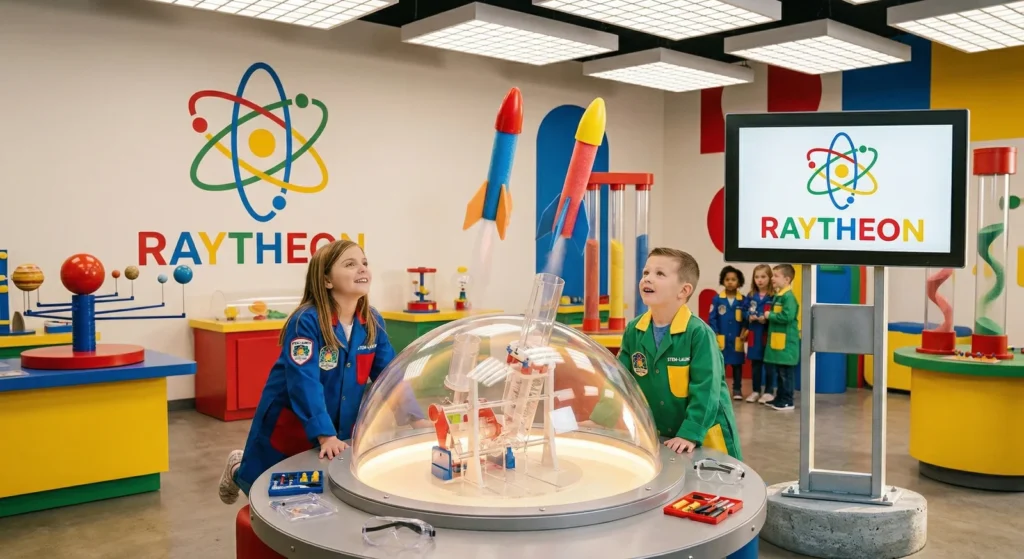
Maybe (I hope) one of the more obvious problematic fake case studies where kids learn about missile guidance systems
The point wasn't to trick anyone. I even intentionally delayed the launch to be well after April Fool's because it felt like a bigger idea. Most people who 👍'd the post knew what they were looking at. Some didn't. Part of the point is that the conditions that let a fake (arguably evil) exploitative agency land as a real announcement on LinkedIn are the same conditions that let real exploitative agencies, companies or projects land as real announcements on LinkedIn. These mediums do not reward careful reading - I probably would have fallen for this post myself if I was just scrolling past. I felt that the only way I could launch something like this was to fully commit to the bit - it wouldn't have landed the same if I had posted "hey check out my dystopian experiential company lol."The voice that was used helped it blend in and made the work seem natural. I built a site to, in part, make that argument and the launch made the argument for me.
I've worked in experiential since about 2010, most of it at one agency. I've done work that I think is legitimately good and that I'm still proud of. I've done work that is fine. And then there is some work where the brief asks for something the language of the brief can't say outwardly. A campaign for a client whose business model or product was harder to stomach than the activation suggested. Invasive data capture methods, a strange target demographic, maybe exploitative of people who had no say in how the activation came to life, or a client who is actively harming the environment.
I've been in the room for real briefs on products that promised to deliver a safer alternative to smoking that were definitely just a different cigarette. I've been in a South African village that barely had a working plumbing system - I was there only to get a tech enabled vending machine to give cans of soda to villagers that were filmed for a commercial. I've executed projects for brands I would otherwise not support in public. I've been asked about all the various ways that data can be sucked out of people visiting an experience, whether they explicitly consent to it or not. I pushed back internally on some of these. Some of them I worked on anyway. That's how the structure works sometimes - individual agency and conscience is not always the lever it sometimes feels like it could be.
I've been carrying the idea for Palatable for years - maybe originally as a funny experiment or riff on "what about if this real brief was just a little more evil?". It became a viable weekend project once AI tools made the production effort match the conceptual lift. Most of the actual labor was on the case-study concepts. I had to find ideas ridiculous enough to be unmistakably as satire to a careful reader, while plausible enough that the agency voice would carry them. Finding that line is hard. I think some of the projects feel suspiciously similar to projects that already exist, even if their premise is just slightly more ridiculous.
A meaningful share of the case studies aren't about my work or my industry. They're about document corporate behavior translated into the deadpan agency voice. The Palantir case study describes a "Community Safety Lab" that aggregates resident-marked unsafe zones and sells the data to insurance and real-estate forms. The activation is invented but the data pipeline is the company's actual business. The CoreCivic case study is an escape room whose puzzles replicate the bureaucratic obstacles incarcerated people face. The obstacles are real but the the experience is what an experiential agency would be asked to build if CoreCivic decided it needed a humanizing brand moment. Raytheon, ExxonMobile, Purdue Pharma , Nestlé Waters - all similar translations. Take what the company actually does to people or the environment, render in a language that an agency uses to celebrate the work, and, voilâ, the result sometimes feels a little harder hitting than a think piece would have.
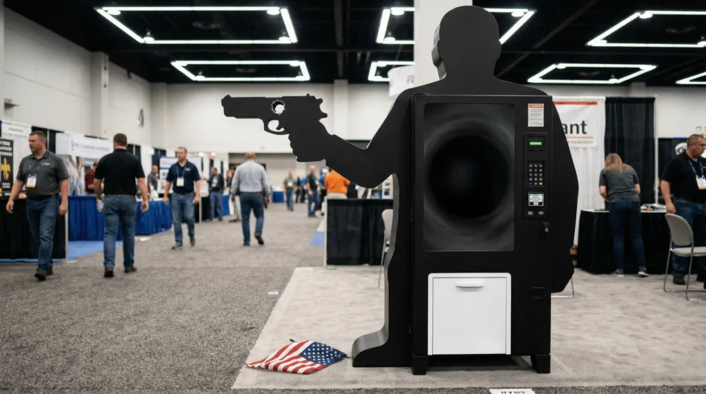
An imaginary installation for Smith and Wesson where users get a free American flag if they stick the barrel of a recently fired gun into a giant vending machine
The argument is that the language itself is the indictment. Experiential agency communication hallmarks of the casestudy format, the bulleted results with billions of impressions, the words "approach"+"challenge"+"result," and the soft euphemism about what was extracted. All of that flattens the stakes of what is being described. It's a voice designed to make commercial activity feel kind of like a civic gift, like it's not a transactional experience at the end of the day. Take three lines from one of the case studies: "100% of visitors' biometric data was retained under Section 14(b) of the terms of entry. The phrase 'my Google twin knows me better than I know myself' trended for 48 hours. Average data capture per guest: 1.2 terabytes." Read fast, that's a results section. Read slowly, it's a description of mass biometric extraction reframed as a brand moment. The sentences don't change but the register does. When you write in that clinical voice about practices the voice can't comfortably name, the gap between language and content becomes the visible thing. You aren't satirizing the practices, exactly. You're letting the language describe them in its own voice and watching what comes out.
The Yes Men have been doing a harder version of this for over 25 years. Igor Vamos, who is half of the group, was one of my professors in college. One of thier most famous stunt's was an impersonator going on the BBC as a Dow Chemical representative to apologize for the Bhopal disaster. It was a fake apology, in the language of corporate accountability, for a real catastrophe nobody had ever properly apologized for. Palatable is much softer than that. But the lineage is the same: fake corporate communication that operates in real institutional space, using the discipline's own grammar against the things the discipline does.
Someone in the comments compared the project to Giovanni Battista Piranesi's Carceri d'Invenzione, the 18th century etchings of imaginary prisons. I had to look him up. It was one of the more useful frames that anyone had shared with me about what I was trying to express.

Piranesi was trained as an architectural draftsman. The Carceri use the full vocabulary of legit architectural illustration. The precise linework, the perspective, the shading. These are all tools to render the impossible spaces of ascending and descending staircases, ropes, and pulleys whose function the viewer recognizes without being told explicitly the terrible things they can be used for. The drawings work because they look like reach architectural renderings. A clumsy version of the same thing wouldn't land, they have to be nearly indistinguishable from the real thing.
Palatable is trying to do the same trick at a much smaller scale. The case studies have to look real. The platform has to emulate what a real platform would look like. The design has to feel clean. These features couldn't slip. If I let an obvious wink into the copy, or used an obviously cartoonish brand name (the partners section, notwithstanding - Mindhonk 4evr), or described the work in a voice the industry doesn't use, the whole thing collapses into parody, which is much easier to dismiss. Parody is comfortable. The discomfort I was trying to produce with the project is the recognition that the language doesn't need to be exaggerated to describe what's happening. It only has to be used completely straight.
This all brings me back to the launch. The deadpan post worked because LinkedIn is build to reward exactly the reading habit it requires: scan, react, scroll, congratulate. This is not a failure or one particular reader, I fall for it constantly, but it is the design of the social media surface it inhabits. I'm not saying anything new when I say that the medium doesn't give people the conditions to encounter the details of the questionable case studies - it gives them the conditions to encounter an announcement.
Real exploitative campaigns benefit from the same design. The case studies that get written about real activations on real agency sites are scanned by the same people in the same way. The language flatters the reader and the work, and the reader moves on. The mechanism that let my fake launch land like a real thing for so many people is the same mechanism that lets other problematic things through. Data extraction, surveillance partnerships, targeting vulnerable demographics - can get described as community engagement and read as such.
There was one specific pattern in the comments section of the post that is worth pointing out. A small number of replies offered something like creative collaboration in the project's voice — proposed case studies, riffs on the agency's vocabulary, suggestions of brands or scenarios. People wanted to enter the world and go LARP'ing with me in a dystopian landscape. That's a sign the satirical surface has enough grit to be inhabited. It's also a sign of something less comfortable. The vocabulary fit because the role was already familiar. When on autopilot, we have been trained, by the actual conditions of contemporary commercial life, to imagine ourselves as "substrates" by default.
This isn't only about an industry doing things to other people. It's about an industry that has already done a meaningful share of these things to you. Your location data is in a database somewhere. If you've used a connected device while grieving, your grief has been modeled. Your kid's Saturday morning enrichment was probably sponsored by something. If you've ever spit in a tube to find out where your great-grandparents were from, your DNA is licensed. The case studies on Palatable are not a forecast of what experiential agencies might do in 2030 — they are mostly a translation of what has already been done, to most readers of this essay, in language that did not announce itself as harm. The deadpan register works on you because the same register has worked on you for years. Every privacy policy, every onboarding flow, every "we value your trust" email is the same vocabulary used to describe what is happening to you. You have been reading variants of this copy for a decade and clicking accept on it.
Some of what the case studies depict happens to real people who don't get to opt out of being depicted. Satire that critiques power has a cost structure where some readers may feel the work doesn't have standing to render their experience, even in fiction. I removed one case study before launch — a heritage festival concept that turned on DNA collection — because on reflection the discomfort it produced was landing on the "substrate" rather than as a corporate indictment. That removal is the kind of calibration I expect to keep doing. I'm definitely open to hearing where the rest of the work gets it wrong.
What I'm not open to is the more comfortable reading where the project is a clever provocation about a problem we all already know about. The point isn't that surveillance capitalism is bad, or that experiential marketing can go or has gone too far, or that brands are creepy sometimes. Those are all true and none of them are the core of the argument. The argument is that the language we use to describe this work is doing a meaningful share of the work itself. The register is part of how the practices remain unobjectionable to the people writing case studies about them (including, for the last fifteen-plus years, me).
If you read a case study on Palatable and recognized the room it would have been pitched in, that's the discomfort I built the site to produce. The deadpan is doing a job. So is the language any of us would have used to write the deck.
Palatable is at palatable.work (triple click the "03 Work" on the left column to see all case studies, not just a randomly generated selection)
In the spirit of this essay, it is important to me to disclose that this essay (and a large portion of the copy and content on Palatable) was drafted, structured and edited in conversation with Claude (Anthropic). The personal material, the decisions about what to keep, and the final form are mine.